Joyse
One license for complete use: desktop, web, app and social. Select the company size for which the typography will be used.
To download the demo version, you need to create an account and download from it.
Do you have a merchandising or logo project? Contact us to confirm the use and price of typography.
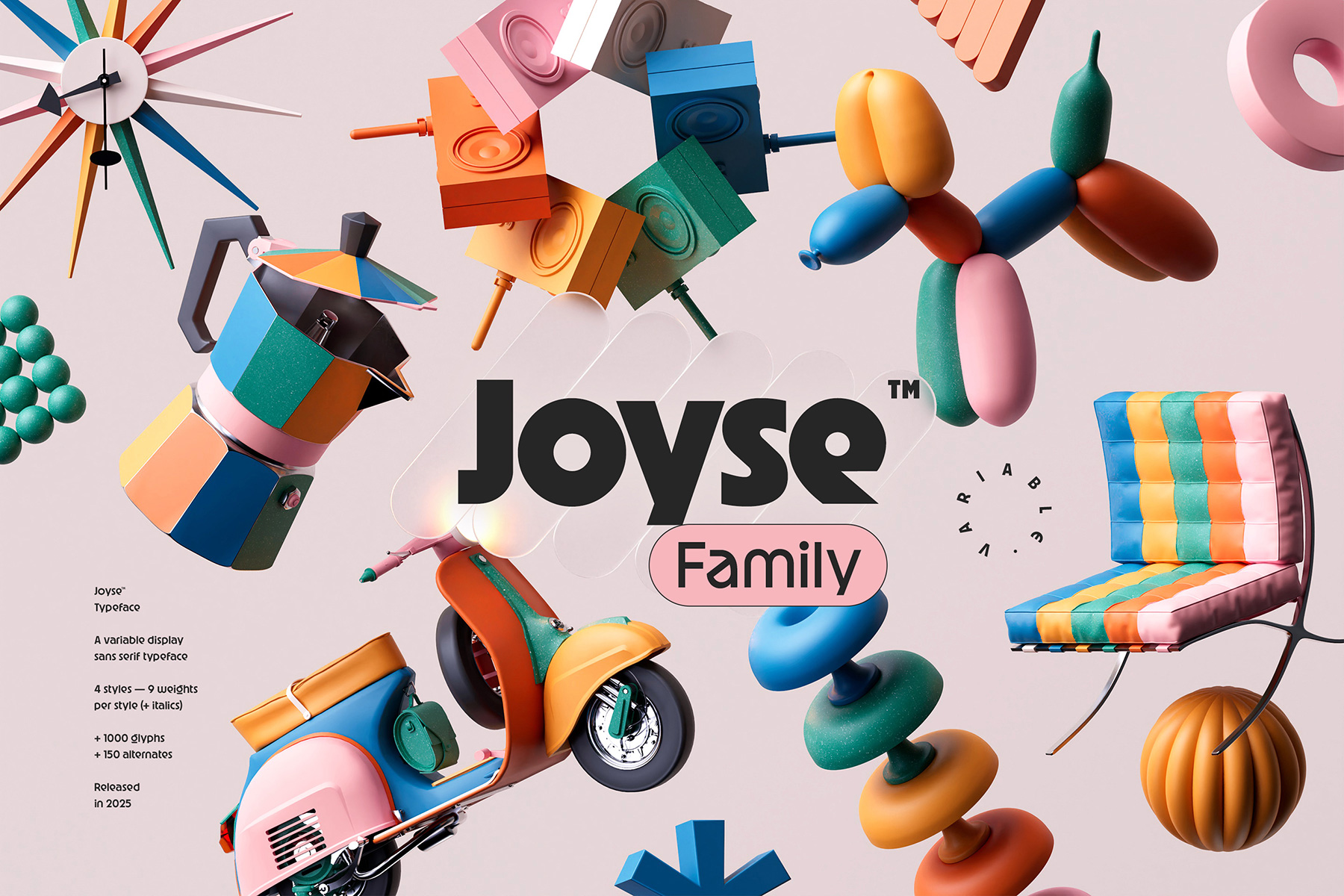
The bold, sensual decadence of vintage.
The clash of contrasts, the elegance of excess. Joyse is a typeface that embraces the tumultuous soul of vintage. At the crossroads of roundness and sharp breaks, it’s an ode to design as provocation. Bold, thick but never heavy, Joyse captures the energy of a time when creativity knew no bounds. It doesn’t follow the rules, it makes them its own. It doesn’t revisit a nostalgic past: it invents a modern icon, both retro and timeless.
Each letter is a balance between gentleness and tension. The incisive “e”, the hypnotic “g”, each glyph has its own character. With its generous curves and sharp edges, Joyse evokes the exuberance of soft carpets, colorful tapestries and the golden age of plastic, in today’s version. A typography that speaks as much of casualness as of visionary design.
Solar and carnal, Joyse is a visual statement. It’s a nod to the boldness and freedom of an era when excess became art, and every shape was conceived as a graphic revolution.
A subtle blend of fluidity and brilliance.
Inspired by insolence and opulence, Joyse embodies an unlikely balance that we love. Its controlled exaggeration reflects the post-modernist movement that has shaken up design in its entirety. The lines are broad and assertive, but every detail is meticulous. While inspired by excess, Joyse retains its share of precision. With one foot in laxity, the other in mastery, it is distinguished by sculpted glyphs. Sinuous as a dance floor, each character brings its own singularity, oscillating between nostalgic lightness and sharp modernity.
Joyse isn’t just a typeface: it’s an attitude. It breaks away from convention and dares a hint of arrogance. It’s proof that elegance can also be provocative.
Use
Logotypes, posters, magazine covers or a strong visual identity: Joyse lends itself to anything that wants to make an impression. It imposes its style and presence like a graphic cry, and that’s precisely what makes it a must-have.
With its sweeping curves and brutal angles, it evokes the flamboyant lettering of vinyl sleeves and the eccentricity of neon lights. It doesn’t fit in: it occupies space. Joyse channels your style into a unique typographic signature. Its imposing fatness and play of visual tensions give it the role of leading actress, transforming every composition into a statement. There’s no room for half-measures: we’re all about assertion.
And also
In the genre of retro travel, with a musical air, we offer you a tour of the decade that followed with VHS Fitness.
Supported languages
Afrikaans, Albanian, Asu, Basque, Bemba, Bena, Breton, Catalan, Chiga, Colognian, Cornish, Croatian, Czech, Danish, Dutch, Embu, English, Esperanto, Estonian, Faroese, Filipino, Finnish, French, Friulian, Galician, Ganda, German, Gusii, Hungarian, Inari Sami, Indonesian, Irish, Italian, Jola-Fonyi, Kabuverdianu, Kalenjin, Kamba, Kikuyu, Kinyarwanda, Latvian, Lithuanian, Lower Sorbian, Luo, Luxembourgish, Luyia, Machame, Makhuwa-Meetto, Makonde, Malagasy, Maltese, Manx, Meru, Morisyen, Northern Sami, Northern Ndebele, Norwegian Bokmål, Norwegian Nynorsk, Nyankole, Oromo, Polish, Portuguese, Quechua, Romanian, Romansh, Rombo, Rundi, Rwa, Samburu, Sango, Sangu, Scottish Gaelic, Sena, Serbian, Shambala, Shona, Slovak, Soga, Somali, Spanish, Swahili, Swedish, Swiss German, Taita, Teso, Turkish, Upper Sorbian, Uzbek (Latin), Volapük, Vunjo, Walser, Welsh, West Frisian, Zulu.
Credits & details
Variable typeface with 2 axes: Weight, Italic
4 styles: Original, Straight, Smooth & Classic
Statics fonts: 9 weights per style + italics
Type Designer : Jérémie Gauthier
Art Direction : Jérémie Gauthier & Romain Billaud
Release date : 2025
Formats : OTF, WOFF, WOFF
FAQs
What does personal use mean?
All our fonts come with a trial version. You can use these files, which include the complete set of glyphs. This usage is limited to unpublished work only. If you publish your project, you must obtain a license suitable for type usage.
Who should purchase the typography license? The designer or the client?
One license per project. The purchaser can be either the client or the designer and must choose the appropriate license according to the criteria specified in the purchase form.
What does the Global License include?
It covers all uses except for logo creation, merchandising, and media/cinema usage. It includes:
• The Desktop License
• The Web License
• The App License
• The Social Media License
Do I need a separate license for each project ?
Yes, you generally need a separate license for each of your projects.
Using a single license across multiple projects or use cases with distinct licensing requirements may lead to compliance issues. For instance, if you use a web license for multiple websites that collectively exceed the allowed page views, you would be violating the license terms.
Do I need a separate license for each use case?
Yes, you generally need a separate license for each of use cases.
Licenses specify the permitted uses of the font, and if you plan to integrate it in multiple ways, you may require multiple licenses. For example, creating a logo and a website would require purchasing two different licenses.
When should I purchase a Logo License?
A logo license is required for each company logo that incorporates the font. This license allows you to use the logo in any context. The license coverage must reflect the total number of employees in the company using the logo, as specified in the purchase form. The starting price is €200 and varies depending on your company’s size.
What does the Merchandising License cover?
The merchandising license covers your creations used on products intended for sale (goodies, clothing, etc.). This does not apply if the font is only used in the company’s logo and you already hold a logo license.
What does the Media/Cinema License cover?
You will need this broadcast license for an advertising campaign aired on television, a spot shown on TV media, or any other use on TV/cinema screens. Please contact us for more details about this license.
What font file formats do you provide with a license purchase?
Each license purchase includes the full set of purchased font families in the following formats: OTF, WOFF, and WOFF2.
Do you offer custom typography design services?
Yes! Discover our services here: Custom your own font!
I purchased the wrong style. What should I do?
Send us an email via our contact page, and we will transfer the license to the desired style and send you the correct files.
I purchased the same style more than once. What should I do?
If it’s the exact same style or weight, simply email us through our contact page, and we will refund the extra unwanted purchases.
Can my project be featured in your "Font in Use" section?
Yes, absolutely! Just send us a brief overview and some visuals via email, and we’ll review it.
In the meantime, feel free to browse the featured projects for inspiration!
