Almarena Neue Typeface
One license for complete use: desktop, web, app and social. Select the company size for which the typography will be used.
To download the demo version, you need to create an account and download from it.
Do you have a merchandising or logo project? Contact us to confirm the use and price of typography.
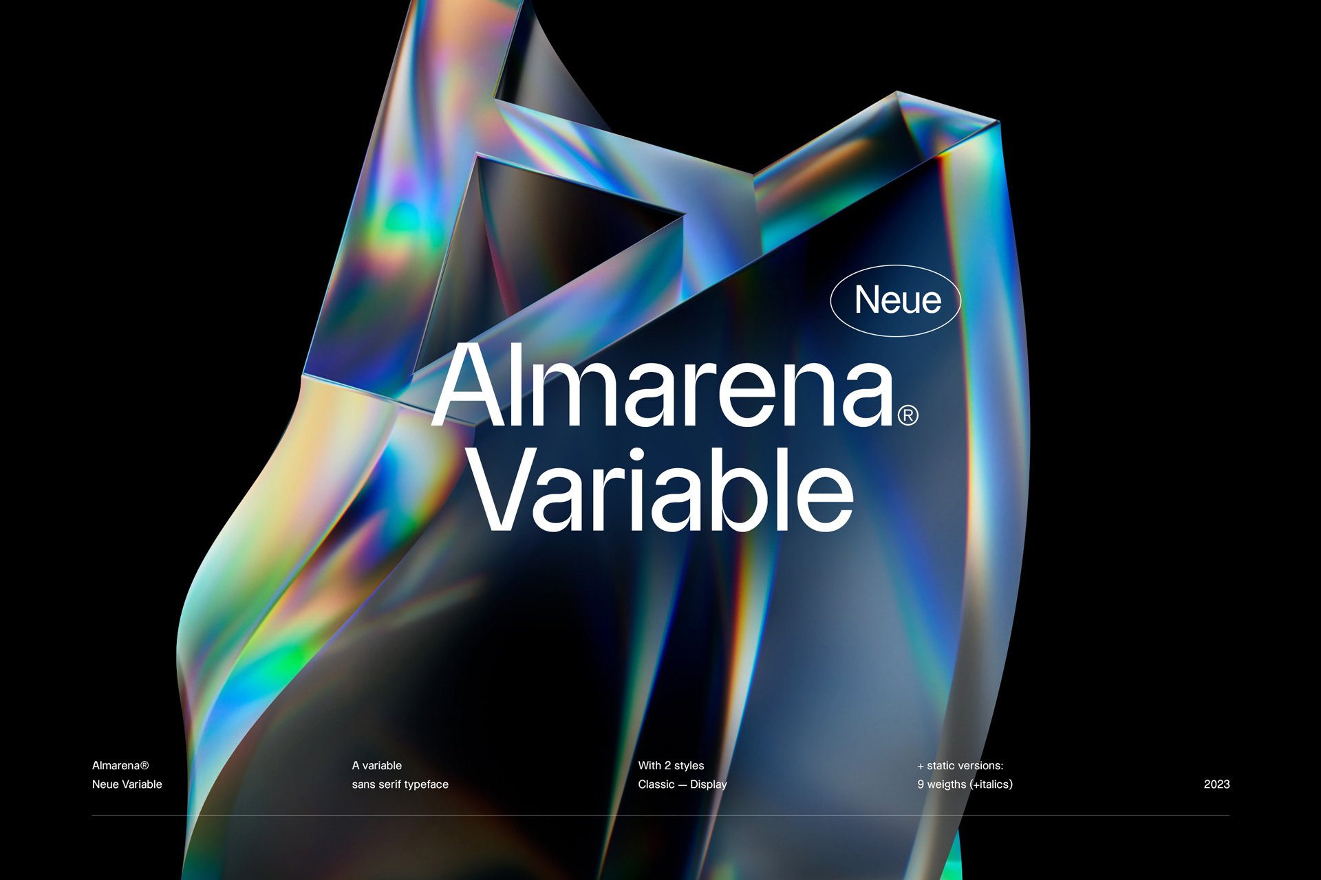
Almarena Neue® Typeface – A model from the past reimagined for today’s visual landscape.
Timeless and meticulously designed, Almarena® Typeface perfectly combines 3 aspects that seemed essential to us: modernity, readability and originality. It is with the desire and the need for a typography that resembles us that the vision of characters reflecting rigor and precision came to us. The assured “A” and the voluptuous “X”, Almarena Neue® Typeface is solid and sensual at the same time.
Here, no serifs or additional frills, Almarena Neue® Typeface proudly displays a slight variant, a touch of singularity that differentiates it from the classic Helvetica. Its ink traps naturally make it a strong font that stands out with its unique, thin hairlines. A complex simplicity, a thoughtful minimalism and a timeless multi-use that make it an aerial typography, freed from the subjective, with perfect optical harmony, which can write everything: as brief as it is irresistible. It is an air of typographic hegemony that floats above this sober, modest and light alphabet. Almarena® Typeface is neutral efficiency and discretion par excellence.
Almarena Neue® Typeface – Inspired by the first lineals.
Lineal or Grotesk, they appeared in the 19th century. Contemporary from the classic, they do away with serifs and other traditional ornaments. These typographies abandon references to the past and become a symbol of modernity among poster designers. They are used in capitals, large and showy: they have to be spotted from afar, they are simple, legible and direct. In the 1960s, they became a staple and were in vogue on all industrial signs. Even today, lineals are omnipresent in your life. Do you see them now?
Use
This modern and unique lineal easily finds its place in your creations. Web or publishing, on screen or glossy paper, Almarena Neue® Typeface gives you character and brings its touch of originality.
It is a first class, strict, almost corseted brand impression that is felt at Almarena Neue® Typeface. Since it is a classic of glyph patterns, it reflects all genders and people.
The big brands of our world like Apple or Chanel have already adopted lineals to represent their image. Impact and simplicity will be the key words of your ideas.
And also
1769® Display is also proof of typographic timelessness. Born from the Romantic movement of the 18th and 19th centuries, it spans the ages and tells us part of the past. I want to time travel. ->
Supported languages
Afrikaans, Albanian, Asu, Basque, Bemba, Bena, Breton, Catalan, Chiga, Colognian, Cornish, Croatian, Czech, Danish, Dutch, Embu, English, Esperanto, Estonian, Faroese, Filipino, Finnish, French, Friulian, Galician, Ganda, German, Gusii, Hungarian, Inari Sami, Indonesian, Irish, Italian, Jola-Fonyi, Kabuverdianu, Kalenjin, Kamba, Kikuyu, Kinyarwanda, Latvian, Lithuanian, Lower Sorbian, Luo, Luxembourgish, Luyia, Machame, Makhuwa-Meetto, Makonde, Malagasy, Maltese, Manx, Meru, Morisyen, Northern Sami, Northern Ndebele, Norwegian Bokmål, Norwegian Nynorsk, Nyankole, Oromo, Polish, Portuguese, Quechua, Romanian, Romansh, Rombo, Rundi, Rwa, Samburu, Sango, Sangu, Scottish Gaelic, Sena, Serbian, Shambala, Shona, Slovak, Soga, Somali, Spanish, Swahili, Swedish, Swiss German, Taita, Teso, Turkish, Upper Sorbian, Uzbek (Latin), Volapük, Vunjo, Walser, Welsh, West Frisian, Zulu.
Credits & details
Variable typeface with 3 axes: Weight, Display, Italic
2 styles: Classic & Display
Statics fonts: 9 weights per style + italics
Type Designer : Jérémie Gauthier
Art Direction : Jérémie Gauthier & Romain Billaud
Release date : 2023
Formats : OTF, WOFF, WOFF
FAQs
What does personal use mean?
All our fonts come with a trial version. You can use these files, which include the complete set of glyphs. This usage is limited to unpublished work only. If you publish your project, you must obtain a license suitable for type usage.
Who should purchase the typography license? The designer or the client?
One license per project. The purchaser can be either the client or the designer and must choose the appropriate license according to the criteria specified in the purchase form.
What does the Global License include?
It covers all uses except for logo creation, merchandising, and media/cinema usage. It includes:
• The Desktop License
• The Web License
• The App License
• The Social Media License
Do I need a separate license for each project ?
Yes, you generally need a separate license for each of your projects.
Using a single license across multiple projects or use cases with distinct licensing requirements may lead to compliance issues. For instance, if you use a web license for multiple websites that collectively exceed the allowed page views, you would be violating the license terms.
Do I need a separate license for each use case?
Yes, you generally need a separate license for each of use cases.
Licenses specify the permitted uses of the font, and if you plan to integrate it in multiple ways, you may require multiple licenses. For example, creating a logo and a website would require purchasing two different licenses.
When should I purchase a Logo License?
A logo license is required for each company logo that incorporates the font. This license allows you to use the logo in any context. The license coverage must reflect the total number of employees in the company using the logo, as specified in the purchase form. The starting price is €200 and varies depending on your company’s size.
What does the Merchandising License cover?
The merchandising license covers your creations used on products intended for sale (goodies, clothing, etc.). This does not apply if the font is only used in the company’s logo and you already hold a logo license.
What does the Media/Cinema License cover?
You will need this broadcast license for an advertising campaign aired on television, a spot shown on TV media, or any other use on TV/cinema screens. Please contact us for more details about this license.
What font file formats do you provide with a license purchase?
Each license purchase includes the full set of purchased font families in the following formats: OTF, WOFF, and WOFF2.
Do you offer custom typography design services?
Yes! Discover our services here: Custom your own font!
I purchased the wrong style. What should I do?
Send us an email via our contact page, and we will transfer the license to the desired style and send you the correct files.
I purchased the same style more than once. What should I do?
If it’s the exact same style or weight, simply email us through our contact page, and we will refund the extra unwanted purchases.
Can my project be featured in your "Font in Use" section?
Yes, absolutely! Just send us a brief overview and some visuals via email, and we’ll review it.
In the meantime, feel free to browse the featured projects for inspiration!
